
使用 Tailwind 构建可重用的 React 组件
已发表: 2022-03-10在这篇文章中,我们将介绍几种不同的方法来构建可重用的 React 组件,这些组件在后台利用 Tailwind,同时向其他组件公开一个漂亮的接口。 这将通过从长长的类名列表转移到更易于阅读和维护的语义道具来改进您的代码。
你需要使用过 React 才能很好地理解这篇文章。
Tailwind 是一个非常流行的 CSS 框架,它提供低级实用程序类来帮助开发人员构建自定义设计。 它在过去几年中越来越受欢迎,因为它很好地解决了两个问题:
- Tailwind 可以轻松地对 HTML 进行迭代更改,而无需通过样式表来查找匹配的 CSS 选择器。
- Tailwind 有合理的约定和默认设置。 这使人们无需从头开始编写 CSS 即可轻松上手。
添加综合文档,Tailwind 如此受欢迎也就不足为奇了。
这些方法将帮助您转换如下所示的代码:
<button className="bg-blue-500 hover:bg-blue-700 text-white font-bold py-2 px-4 rounded"> Enable </button>要编写如下所示的代码:
<Button size="sm" textColor="white" bgColor="blue-500"> Enable </Button> 两个片段之间的区别在于,第一个片段使用了标准的 HTML 按钮标签,而第二个片段使用了<Button>组件。 <Button>组件是为了可重用性而构建的,并且由于它具有更好的语义而更易于阅读。 它不是使用一长串类名,而是使用属性来设置各种属性,例如size 、 textColor和bgColor 。
让我们开始吧。
方法 1:使用 Classnames 模块控制类
将 Tailwind 适配到 React 应用程序的一种简单方法是包含类名并以编程方式切换它们。
classnames npm 模块使在 React 中切换类变得容易。 为了演示如何使用它,让我们举一个用例,您的 React 应用程序中有<Button>组件。
// This could be hard to read. <button className="bg-blue-500 hover:bg-blue-700 text-white font-bold py-2 px-4 rounded">Enable</button> // This is more conventional React. <Button size="sm" textColor="white" bgColor="blue-500">Enable</Button> 让我们看看如何分离 Tailwind 类,以便使用此<Button>组件的人可以使用 React 道具,例如size 、 textColor和bgColor 。
- 将
bgColor和textColor等 props 直接传递到类名字符串模板中。 - 使用对象以编程方式切换类名(就像我们使用
size属性所做的那样)
在下面的示例代码中,我们将看看这两种方法。
// Button.jsx import classnames from 'classnames'; function Button ({size, bgColor, textColor, children}) { return ( <button className={classnames("bg-${bgColor} text-${textColor} font-bold py-2 px-4 rounded", { "text-xs": size === 'sm' "text-xl": size === 'lg', })}> {children} </button> ) }; export default Button; 在上面的代码中,我们定义了一个Button组件,它采用以下 props:
-
size
定义按钮的大小并应用 Tailwind 类text-xs或text-xl -
bgColor
定义按钮的背景颜色并应用 Tailwindbg-*类。 -
textColor
定义按钮的文本颜色并应用 Tailwindtext-* classes。 -
children
任何子组件都将在这里传递。 它通常包含<Button>中的文本。
通过定义Button.jsx ,我们现在可以将其导入并使用 React props 而不是类名。 这使我们的代码更易于阅读和重用。
import Button from './Button'; <Button size="sm" textColor="white" bgColor="blue-500">Enable</Button>为交互组件使用类名
Button 是一个非常简单的用例。 更复杂的事情呢? 好吧,您可以进一步制作交互式组件。
例如,让我们看一下使用 Tailwind 制作的下拉菜单。
使用 Tailwind 和类名切换构建的交互式下拉列表。
对于这个示例,我们使用 Tailwind CSS 类名创建 HTML 组件,但我们公开了一个如下所示的 React 组件:
<Dropdown options={\["Edit", "Duplicate", "Archive", "Move", "Delete"\]} onOptionSelect={(option) => { console.log("Selected Option", option)} } /> 查看上面的代码,您会注意到我们没有任何 Tailwind 类。 它们都隐藏在<Dropdown/>的实现代码中。 这个Dropdown组件的用户只需要提供一个options列表和一个单击处理程序,当单击一个option时onOptionSelect 。
让我们看看如何使用 Tailwind 构建这个组件。
去掉一些不相关的代码,这里就是逻辑的症结所在。 您可以查看此 Codepen 以获取完整示例。
import classNames from 'classnames'; function Dropdown({ options, onOptionSelect }) { // Keep track of whether the dropdown is open or not. const [isActive, setActive] = useState(false); const buttonClasses = `inline-flex justify-center w-full rounded-md border border-gray-300 px-4 py-2 bg-white text-sm leading-5 font-medium text-gray-700 hover:text-gray-500 focus:outline-none focus:border-blue-300 focus:shadow-outline-blue active:bg-blue-500 active:text-gray-200 transition ease-in-out duration-150`; return ( // Toggle the dropdown if the button is clicked <button onClick={() => setActive(!isActive)} className={buttonClasses}> Options </button> // Use the classnames module to toggle the Tailwind .block and .hidden classes <div class={classNames("origin-top-right absolute right-0 mt-2 w-56 rounded-md shadow-lg", { block: isActive, hidden: !isActive })}> // List items are rendered here. {options.map((option) => <div key={option} onClick={(e) => onOptionSelect(option)}>{option}</div>)} </div> ) } export default Dropdown; 下拉菜单通过使用.hidden和.block类有选择地显示或隐藏来实现交互。 每当按下<button>时,我们都会触发切换isActive状态的onClick处理程序。 如果按钮处于活动状态( isActive === true ),我们设置block类。 否则,我们设置hidden类。 这些都是用于切换显示行为的 Tailwind 类。

总之,classnames 模块是一种以编程方式控制 Tailwind 类名的简单而有效的方法。 它使将逻辑分离到 React props 中变得更容易,从而使您的组件更易于重用。 它适用于简单的交互式组件。
方法 2:使用常量定义设计系统
另一种同时使用 Tailwind 和 React 的方法是使用常量并将 props 映射到特定常量。 这对于构建设计系统是有效的。 让我们用一个例子来演示。
从列出设计系统的theme.js文件开始。
// theme.js (you can call it whatever you want) export const ButtonType = { primary: "bg-blue-500 hover:bg-blue-700 text-white font-bold rounded", secondary: "bg-blue-500 hover:bg-blue-700 text-white font-bold rounded", basic: "bg-white hover:bg-gray-700 text-gray-700 font-bold rounded", delete: "bg-red-300 hover:bg-red-500 text-white font-bold rounded" }; export const ButtonSize = { sm: "py-2 px-4 text-xs", lg: "py-3 px-6 text-lg" }在这种情况下,我们有两组常量:
-
ButtonType定义了我们应用程序中按钮的样式。 -
ButtonSizes定义了我们应用程序中按钮的大小。
现在,让我们编写我们的<Button>组件:
import {ButtonType, ButtonSize} from './theme'; function Button({size, type, children}) { // This can be improved. I'm keeping it simple here by joining two strings. const classNames = ButtonType[type] + " " + ButtonSize[size]; return ( <button className={classNames}>{children}</button> ) } export default Button; 我们使用ButtonType和ButtonSize常量来创建类名列表。 这使我们的<Button>的界面更加美观。 它让我们可以使用size和type属性,而不是将所有内容都放在类名字符串中。
// Cleaner and well defined props. <Button size="xs" type="primary">Enable</Button>与之前的方法相比:
// Exposing class names <button className="py-2 px-4 text-xs bg-blue-500 hover:bg-blue-700 text-white font-bold rounded">Enable</button> 如果您需要重新定义应用程序中按钮的外观,只需编辑theme.js文件,应用程序中的所有按钮都会自动更新。 这比在各种组件中搜索类名更容易。
方法 3:使用@apply组合实用程序
第三种提高 React 组件易读性的方法是使用 CSS 和 PostCSS 中可用的@apply模式来提取重复的类。 这种模式涉及使用样式表和后处理器。
让我们通过一个例子来演示它是如何工作的。 假设您有一个包含主要和次要按钮的按钮组。
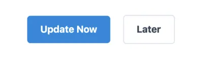
<button className="py-2 px-4 mr-4 text-xs bg-blue-500 hover:bg-blue-700 text-white font-bold rounded">Update Now</button> <button className="py-2 px-4 text-xs mr-4 hover:bg-gray-100 text-gray-700 border-gray-300 border font-bold rounded">Later</button> 使用@apply模式,您可以将此 HTML 编写为:
<button className="btn btn-primary btn-xs">Update Now</button> <button className="btn btn-secondary btn-xs">Later</button>然后可以将其应用于 React 成为:
import classnames from "classnames"; function Button ({size, type, children}) { const bSize = "btn-" + size; const bType = "btn-" + type; return ( <button className={classnames("btn", bSize, bType)}>{children}</button> ) } Button.propTypes = { size: PropTypes.oneOf(['xs, xl']), type: PropTypes.oneOf(['primary', 'secondary']) }; // Using the Button component. <Button type="primary" size="xs">Update Now</Button> <Button type="secondary" size="xs">Later</Button> 下面介绍如何创建这些 BEM 样式的类名,例如.btn 、 .btn-primary等。 首先创建一个button.css文件:
/\* button.css \*/ @tailwind base; @tailwind components; .btn { @apply py-2 px-4 mr-4 font-bold rounded; } .btn-primary { @apply bg-blue-500 hover:bg-blue-700 text-white; } .btn-secondary { @apply hover:bg-gray-700 text-gray-700 border-gray-300 border; } .btn-xs { @apply text-xs; } .btn-xl { @apply text-xl; } @tailwind utilities;上面的代码不是真正的CSS,但它会被 PostCSS 编译。 这里有一个 GitHub 存储库,它展示了如何为 JavaScript 项目设置 PostCSS 和 Tailwind。
还有一个简短的视频演示了如何在此处进行设置。
使用@apply的缺点
将 Tailwind 实用程序类提取到更高级别的 CSS 类中的概念似乎很有意义,但它有一些您应该注意的缺点。 让我们用另一个例子来强调这些。
首先,通过提取这些类名,我们会丢失一些信息。 例如,我们需要知道.btn-primary必须添加到已经应用了.btn的组件中。 此外, .btn-primary和.btn-secondary不能一起应用。 仅通过查看类,这些信息并不明显。
如果这个组件更复杂,您还需要了解类之间的父子关系。 在某种程度上,这是 Tailwind 旨在解决的问题,通过使用@apply ,我们以不同的方式将问题带回来。
这是一个视频,其中 Tailwind 的创建者 Adam Wathan 深入探讨了使用@apply的利弊。
概括
在本文中,我们研究了将 Tailwind 集成到 React 应用程序以构建可重用组件的三种方法。 这些方法可帮助您使用props构建具有更简洁界面的 React 组件。
- 使用类名模块以编程方式切换类。
- 定义一个常量文件,您可以在其中定义每个组件状态的类列表。
- 使用
@apply提取更高级别的 CSS 类。
如果您有任何问题,请在 Twitter 上@tilomitra 上给我发消息。
SmashingMag推荐阅读:
- 在 React 项目中设置 Tailwind CSS
- 使用 React 创建可排序表
- Firefox 中新的和实验性的 CSS DevTools 指南
- 制作您自己的扩展和收缩内容面板