
前端项目的常见 CSS 问题
已发表: 2022-03-10在浏览器中实现用户界面时,最好尽可能减少这些差异和问题,以便 UI 是可预测的。 跟踪所有这些差异是很困难的,因此我整理了一份常见问题列表及其解决方案,作为您在处理新项目时的方便参考指南。
让我们开始。
1.重置button和input元素的背景
添加按钮时,请重置其背景,否则它在不同浏览器中的外观会有所不同。 在下面的示例中,Chrome 和 Safari 中显示了相同的按钮。 后者添加了默认的灰色背景。
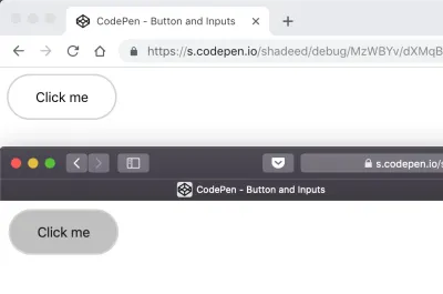
重置后台将解决此问题:
button { appearance: none; background: transparent; /* Other styles */ } 请参阅 CodePen 上 Ahmad Shadeed (@shadeed) 的笔按钮和输入。
2. 溢出: scroll与auto
要限制元素的高度并允许用户在其中滚动,请添加overflow: scroll-y 。 这在 macOS 上的 Chrome 中看起来不错。 但是,在 Chrome Windows 上,滚动条始终存在(即使内容很短)。 这是因为无论内容如何, scroll-y都会显示滚动条,而overflow: auto仅在需要时才会显示滚动条。
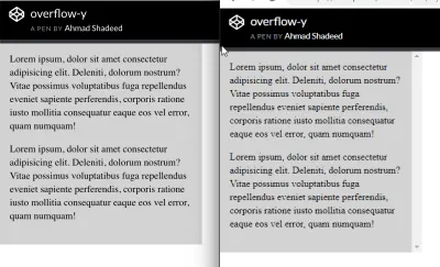
.element { height: 300px; overflow-y: auto; } 请参阅 CodePen 上 Ahmad Shadeed (@shadeed) 的 Pen overflow-y。
3.添加flex-wrap
只需添加display: flex即可使元素表现为 flex 容器。 但是,当屏幕尺寸缩小时,浏览器会显示一个水平滚动条,以防不添加flex-wrap 。
<div class="wrapper"> <div class="item"></div> <div class="item"></div> <div class="item"></div> <div class="item"></div> <div class="item"></div> <div class="item"></div> </div> .wrapper { display: flex; } .item { flex: 0 0 120px; height: 100px; }上面的例子在大屏幕上效果很好。 在移动设备上,浏览器将显示一个水平滚动条。
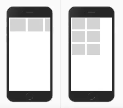
解决方案非常简单。 包装器应该知道当空间不可用时,它应该包装项目。
.wrapper { display: flex; flex-wrap: wrap; } 请参阅 CodePen 上 Ahmad Shadeed (@shadeed) 的 Pen flex-wrap。
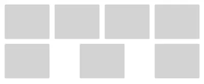
4.当Flex项目的数量是动态的时候不要使用justify-content: space-between
当justify-content: space-between应用于 flex 容器时,它将分配元素并在它们之间留下等量的空间。 我们的示例有八个卡片项目,它们看起来不错。 如果出于某种原因,项目的数量是七个怎么办? 第二行元素看起来与第一行不同。
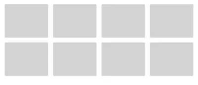
请参阅 CodePen 上 Ahmad Shadeed (@shadeed) 的 Pen justify-content。
在这种情况下,使用 CSS 网格会更合适。
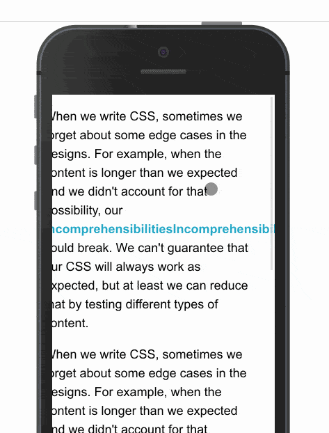
5. 长词和链接
在移动屏幕上查看文章时,长字或内联链接可能会导致出现水平滚动条。 使用 CSS 的word-break可以防止这种情况发生。
.article-content p { word-break: break-all; } 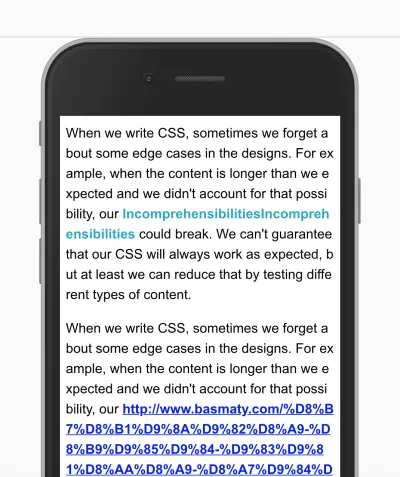
查看 CSS-Tricks 了解详细信息。
6.透明渐变
当添加具有透明起点和终点的渐变时,它在 Safari 中看起来会偏黑。 那是因为 Safari 无法识别关键字transparent 。 通过将其替换为rgba(0, 0, 0, 0) ,它将按预期工作。 请注意以下屏幕截图:
.section-hero { background: linear-gradient(transparent, #d7e0ef), #527ee0; /*Other styles*/ }这应该是:
.section-hero { background: linear-gradient(rgba(0, 0, 0,0), #d7e0ef), #527ee0; /*Other styles*/ } 7. 关于 CSS Grid 中auto-fit和auto-fill区别的误解
在 CSS 网格中, repeat功能可以创建响应式列布局,而无需使用媒体查询。 为此,请使用auto-fill或auto-fit 。
.wrapper { grid-template-columns: repeat(auto-fill, minmax(100px, 1fr)); } 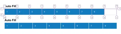
简而言之, auto-fill将排列列而不扩大它们的宽度,而auto-fit会将它们折叠为零宽度,但前提是您有空列。 Sara Soueidan 写了一篇关于这个话题的优秀文章。
8.当视口不够高时将元素固定到屏幕顶部
如果将元素固定到屏幕顶部,如果视口不够高会怎样? 简单:它会占用屏幕空间,因此用户浏览网站的垂直区域会很小且不舒服,这会降低体验。
@media (min-height: 500px) { .site-header { position: sticky; top: 0; /*other styles*/ } }在上面的代码片段中,我们告诉浏览器仅当视口的高度等于或大于 500 像素时才将标题固定到顶部。
同样重要的是:当您使用position: sticky时,除非您指定top属性,否则它将不起作用。
请参阅 CodePen 上 Ahmad Shadeed (@shadeed) 的 Pen Vertical 媒体查询:Fixed Header。

9. 设置图片max-width
添加图像时,定义max-width: 100% ,以便在屏幕较小时调整图像大小。 否则,浏览器将显示水平滚动条。
img { max-width: 100%; } 10. 使用 CSS Grid 定义main和aside元素
CSS 网格可用于定义布局的main部分和aside部分,这是网格的完美用途。 因此, aside section 的高度将等于main元素的高度,即使它是空的。
要解决此问题,请将aside元素与其父元素的开头对齐,以使其高度不会扩大。
.wrapper { display: grid; grid-template-columns: repeat(12, minmax(0, 1fr)); grid-gap: 20px; } // align-self will tell the aside element to align itself with the start of its parent. aside { grid-column: 1 / 4; grid-row: 1; align-self: start; } main { grid-column: 4 / 13; } 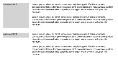
请参阅 CodePen 上 Ahmad Shadeed (@shadeed) 的 Pen main 和 side。
11. 为 SVG 添加fill
有时,在使用 SVG 时,如果在 SVG 中内联添加了fill属性,则fill将无法按预期工作。 为了解决这个问题,要么从 SVG 本身中删除fill属性,要么覆盖fill: color 。
举个例子:
.some-icon { fill: #137cbf; }如果 SVG 有内联填充,这将不起作用。 应该是这样的:
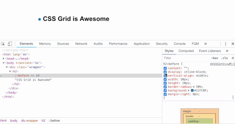
.some-icon path { fill: #137cbf; }12. 使用伪元素
我喜欢尽可能使用伪元素。 它们为我们提供了一种创建虚假元素的方法,主要用于装饰目的,而无需将它们添加到 HTML。
与他们合作时,作者可能会忘记执行以下操作之一:
- 添加
content: ""属性, - 设置
width和height而不为其定义display属性。
在下面的示例中,我们有一个带有徽章的标题作为伪元素。 content: ""属性应该被添加。 此外,该元素应设置display: inline-block以使width和height按预期工作。
13. 使用display: inline-block时的奇怪空间
将两个或多个元素设置为display: inline-block或display: inline将在每个元素之间创建一个微小的空间。 添加空格是因为浏览器将元素解释为单词,因此它在每个元素之间添加了一个字符空格。
在下面的示例中,每个项目在右侧都有8px的空间,但是使用display: inline-block导致的微小空间使其变为12px ,这不是预期的结果。
li:not(:last-child) { margin-right: 8px; } 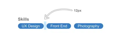
一个简单的解决方法是在父元素上设置font-size: 0 。
ul { font-size: 0; } li { font-size: 16px; /*The font size should be reassigned here because it will inherit `font-size: 0` from its parent.*/ } 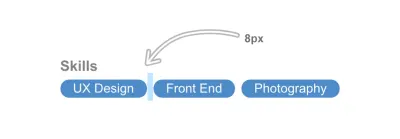
请参阅 CodePen 上 Ahmad Shadeed (@shadeed) 的 Pen Inline Block Spacing。
14. 将标签元素分配给输入时添加for="ID"
使用表单元素时,请确保所有label元素都具有分配给它们的 ID。 这将使它们更易于访问,并且当它们被单击时,相关的输入将获得焦点。
<label for="emailAddress">Email address:</label> <input type="email"> 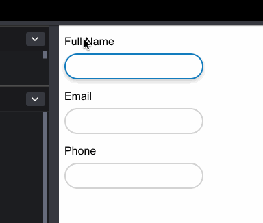
15. 字体不适用于交互式 HTML 元素
将字体分配给整个文档时,它们不会应用于input 、 button 、 select和textarea等元素。 它们默认不继承,因为浏览器将默认系统字体应用于它们。
要解决此问题,请手动分配字体属性:
input, button, select, textarea { font-family: your-awesome-font-name; }16.水平滚动条
由于这些元素的宽度,某些元素会导致出现水平滚动条。
查找此问题原因的最简单方法是使用 CSS 大纲。 Addy Osmani 分享了一个非常方便的脚本,可以将其添加到浏览器控制台中以勾勒页面上的每个元素。
[].forEach.call($$("*"), function(a) { a.style.outline = "1px solid #" + (~~(Math.random() * (1 << 24))).toString(16); }); 
17. 压缩或拉伸图像
在 CSS 中调整图像大小时,如果纵横比与图像的宽度和高度不一致,它可能会被压缩或拉伸。
解决方案很简单:使用 CSS 的object-fit 。 它的功能类似于background-size: cover 。
img { object-fit: cover; } 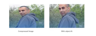
在所有情况下,使用object-fit都不是完美的解决方案。 有些图像需要在没有裁剪或调整大小的情况下显示,有些平台会强制用户上传或裁剪定义大小的图像。 例如,Dribbble 接受 800 x 600 像素的缩略图上传。
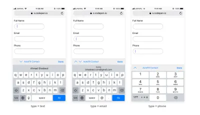
18.为input添加正确的type 。
为input字段使用正确的type 。 这将增强移动浏览器的用户体验,并使用户更容易访问。
这是一些HTML:
<form action=""> <p> <label for="name">Full name</label> <input type="text" id="name"> </p> <p> <label for="email">Email</label> <input type="email" id="email"> </p> <p> <label for="phone">Phone</label> <input type="tel" id="phone"> </p> </form>这是每个输入聚焦后的外观:
19. RTL 布局中的电话号码
在从右到左的布局中添加电话号码(如+ 972-123555777 )时,加号将位于号码的末尾。 要解决此问题,请重新分配电话号码的方向。
p { direction: ltr; } 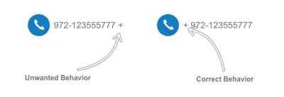
结论
这里提到的所有问题都是我在前端开发工作中遇到的最常见的问题。 我的目标是保留一份清单,以便在处理 Web 项目时定期检查。
你有一个在 CSS 中经常遇到的问题吗? 让我们在评论中知道!