
تعبئة الرسوم المتحركة بتنسيق HTML5 SVG باستخدام CSS3 وجافا سكريبت الفانيليا
نشرت: 2022-03-10يرمز SVG إلى S calable V ector G raphics وهو لغة ترميز قياسية قائمة على XML للرسومات المتجهة. يسمح لك برسم المسارات والمنحنيات والأشكال عن طريق تحديد مجموعة من النقاط في المستوى ثنائي الأبعاد. علاوة على ذلك ، يمكنك إضافة خصائص twitch على تلك المسارات (مثل الحد واللون والسمك والتعبئة والمزيد) لإنتاج الرسوم المتحركة.
منذ أبريل 2017 ، تسمح CSS Level 3 Fill and Stroke Module بتعيين ألوان وأنماط تعبئة SVG من ورقة أنماط خارجية ، بدلاً من تعيين السمات على كل عنصر. في هذا البرنامج التعليمي ، سنستخدم لونًا سداسيًا بسيطًا بسيطًا ، ولكن كل من خصائص التعبئة والحدود تقبل أيضًا الأنماط والتدرجات اللونية والصور كقيم.
ملاحظة : عند زيارة موقع Awwwards الإلكتروني ، لا يمكن عرض شاشة الملاحظات المتحركة إلا مع ضبط عرض المتصفح على 1024 بكسل أو أكثر.
- العرض التوضيحي: ملاحظة عرض المشروع
- الريبو: ملاحظة عرض الريبو
هيكل الملف
لنبدأ بإنشاء الملفات في الجهاز:
mkdir note-display cd note-display touch index.html styles.css scripts.jsلغة البرمجة
هذا هو النموذج الأولي الذي يربط بين ملفات css و js :
<html lang="en"> <head> <meta charset="UTF-8"> <title>Note Display</title> <link rel="stylesheet" href="./styles.css"> </head> <body> <script src="./scripts.js"></script> </body> </html> يتكون كل عنصر من عناصر الملاحظة من عنصر قائمة: li يحتوي على circle وقيمة note label الخاصة بها.
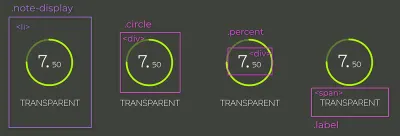
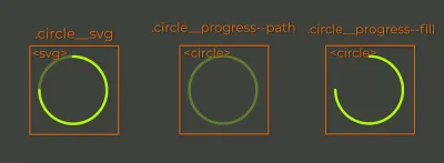
.circle ، .percent ، و .label . (معاينة كبيرة) إن .circle_svg هو عنصر SVG يلتف حول عنصرين من نوع <circle>. الأول هو المسار المراد تعبئته والثاني هو التعبئة التي سيتم تحريكها.
يتم فصل note إلى أعداد صحيحة وكسور عشرية بحيث يمكن تطبيق أحجام خطوط مختلفة عليها. label بسيطة <span> . لذا ، فإن وضع كل هذا معًا يبدو كالتالي:
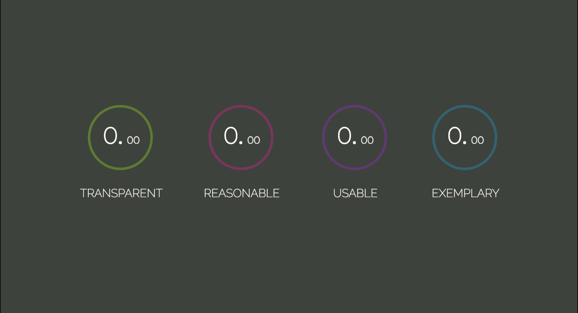
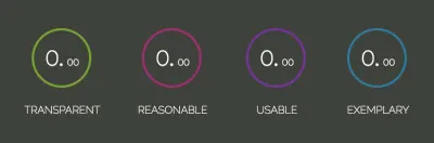
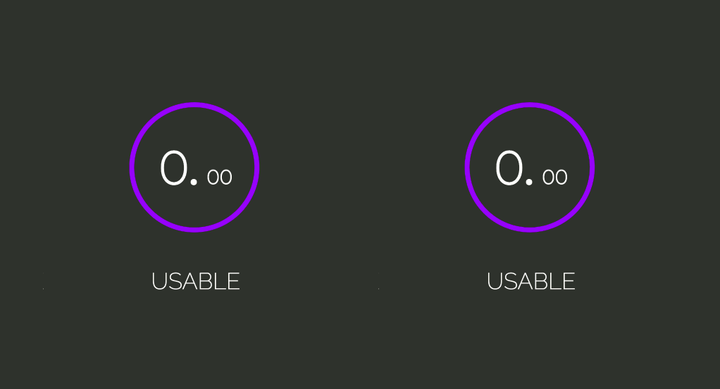
<li class="note-display"> <div class="circle"> <svg width="84" height="84" class="circle__svg"> <circle cx="41" cy="41" r="38" class="circle__progress circle__progress--path"></circle> <circle cx="41" cy="41" r="38" class="circle__progress circle__progress--fill"></circle> </svg> <div class="percent"> <span class="percent__int">0.</span> <span class="percent__dec">00</span> </div> </div> <span class="label">Transparent</span> </li> تحدد سمات cx و cy المحور السيني للدائرة والنقطة المركزية للمحور الصادي. تحدد السمة r نصف قطرها.
ربما لاحظت نمط الشرطة السفلية / الشرطة في أسماء الفئات. هذا هو BEM ، والذي يرمز إلى block element modifier . إنها منهجية تجعل تسمية العناصر الخاصة بك أكثر تنظيمًا وتنظيمًا ودلالة.
يوصى بقراءة : شرح لـ BEM ولماذا تحتاجه
لإنهاء هياكل القوالب ، دعنا نلتف عناصر القائمة الأربعة في عنصر قائمة غير مرتب:
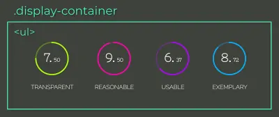
li (معاينة كبيرة) <ul class="display-container"> <li class="note-display"> <div class="circle"> <svg width="84" height="84" class="circle__svg"> <circle cx="41" cy="41" r="38" class="circle__progress circle__progress--path"></circle> <circle cx="41" cy="41" r="38" class="circle__progress circle__progress--fill"></circle> </svg> <div class="percent"> <span class="percent__int">0.</span> <span class="percent__dec">00</span> </div> </div> <span class="label">Transparent</span> </li> <li class="note-display"> <div class="circle"> <svg width="84" height="84" class="circle__svg"> <circle cx="41" cy="41" r="38" class="circle__progress circle__progress--path"></circle> <circle cx="41" cy="41" r="38" class="circle__progress circle__progress--fill"></circle> </svg> <div class="percent"> <span class="percent__int">0.</span> <span class="percent__dec">00</span> </div> </div> <span class="label">Reasonable</span> </li> <li class="note-display"> <div class="circle"> <svg width="84" height="84" class="circle__svg"> <circle cx="41" cy="41" r="38" class="circle__progress circle__progress--path"></circle> <circle cx="41" cy="41" r="38" class="circle__progress circle__progress--fill"></circle> </svg> <div class="percent"> <span class="percent__int">0.</span> <span class="percent__dec">00</span> </div> </div> <span class="label">Usable</span> </li> <li class="note-display"> <div class="circle"> <svg width="84" height="84" class="circle__svg"> <circle cx="41" cy="41" r="38" class="circle__progress circle__progress--path"></circle> <circle cx="41" cy="41" r="38" class="circle__progress circle__progress--fill"></circle> </svg> <div class="percent"> <span class="percent__int">0.</span> <span class="percent__dec">00</span> </div> </div> <span class="label">Exemplary</span> </li> </ul> يجب أن تسأل نفسك ما الذي تعنيه التسميات Transparent Reasonable وقابلة Usable Exemplary . كلما زادت معرفتك بالبرمجة ، ستدرك أن كتابة التعليمات البرمجية لا تتعلق فقط بجعل التطبيق وظيفيًا ، ولكن أيضًا التأكيد على أنه سيكون قابلاً للصيانة على المدى الطويل وقابل للتطوير. يتم تحقيق ذلك فقط إذا كان من السهل تغيير التعليمات البرمجية الخاصة بك.
"يجب أن يساعد الاختصار TRUE في تحديد ما إذا كان الرمز الذي تكتبه سيكون قادرًا على استيعاب التغيير في المستقبل أم لا."لذا ، اسأل نفسك في المرة القادمة:
-
Transparent: هل عواقب تغييرات التعليمات البرمجية واضحة؟ -
Reasonable: هل التكلفة فائدة تستحق كل هذا العناء؟ - قابل
Usable: هل سأكون قادرًا على إعادة استخدامه في سيناريوهات غير متوقعة؟ -
Exemplary: هل يقدم جودة عالية كمثال على الكود المستقبلي؟
ملاحظة : يشرح "التصميم العملي الموجه للكائنات في روبي" لساندي ميتز TRUE جنبًا إلى جنب مع المبادئ الأخرى وكيفية تحقيقها من خلال أنماط التصميم. إذا لم تكن قد استغرقت بعض الوقت لدراسة أنماط التصميم حتى الآن ، ففكر في إضافة هذا الكتاب إلى القراءة قبل النوم.
CSS
دعنا نستورد الخطوط ونطبق إعادة تعيين لجميع العناصر:
@import url('https://fonts.googleapis.com/css?family=Nixie+One|Raleway:200'); * { padding: 0; margin: 0; box-sizing: border-box; } تتضمن خاصية box-sizing: border-box قيم المساحة المتروكة والحدود في العرض والارتفاع الكليين للعنصر ، لذلك من السهل حساب أبعاده.
ملاحظة : للحصول على شرح مرئي حول box-sizing ، يرجى قراءة "اجعل حياتك أسهل باستخدام CSS Box Sizing."
body { height: 100vh; color: #fff; display: flex; background: #3E423A; font-family: 'Nixie One', cursive; } .display-container { margin: auto; display: flex; } من خلال دمج display: flex في body و margin-auto في .display-container ، من الممكن توسيط العنصر الفرعي عموديًا وأفقيًا. سيكون عنصر .display-container أيضًا عبارة flex-container ؛ بهذه الطريقة ، سيتم وضع عناصرها الفرعية في نفس الصف على طول المحور الرئيسي.
سيكون عنصر قائمة .note-display عبارة flex-container أيضًا. نظرًا لوجود العديد من العناصر الفرعية للتوسيط ، فلنقم بذلك من خلال خصائص justify-content و align-items . سيتم توسيط جميع flex-items طول المحور cross والمحور main . إذا لم تكن متأكدًا من ذلك ، فراجع قسم المحاذاة في "الدليل المرئي لأساسيات CSS Flexbox."
.note-display { display: flex; flex-direction: column; align-items: center; margin: 0 25px; } دعنا نطبق حدًا على الدوائر عن طريق تعيين قواعد stroke-width الحد ، stroke-opacity الحد ، وخط stroke-linecap الحد الذي يعمل معًا على نمط انتهاء الحد المباشر. بعد ذلك ، دعنا نضيف لونًا إلى كل دائرة:
.circle__progress { fill: none; stroke-width: 3; stroke-opacity: 0.3; stroke-linecap: round; } .note-display:nth-child(1) .circle__progress { stroke: #AAFF00; } .note-display:nth-child(2) .circle__progress { stroke: #FF00AA; } .note-display:nth-child(3) .circle__progress { stroke: #AA00FF; } .note-display:nth-child(4) .circle__progress { stroke: #00AAFF; } من أجل وضع عنصر percent بشكل مطلق ، من الضروري معرفة ماذا بشكل مطلق. يجب أن يكون عنصر .circle هو المرجع ، لذلك دعونا نضيف position: relative إليه.
ملاحظة : للحصول على شرح مرئي أعمق حول تحديد الموضع المطلق ، يرجى قراءة "كيفية فهم موضع CSS المطلق مرة واحدة وإلى الأبد."
هناك طريقة أخرى لتوسيط العناصر وهي دمج top: 50% ، left: 50% transform: translate(-50%, -50%); التي تضع مركز العنصر في مركز الأصل.
.circle { position: relative; } .percent { width: 100%; top: 50%; left: 50%; position: absolute; font-weight: bold; text-align: center; line-height: 28px; transform: translate(-50%, -50%); } .percent__int { font-size: 28px; } .percent__dec { font-size: 12px; } .label { font-family: 'Raleway', serif; font-size: 14px; text-transform: uppercase; margin-top: 15px; }الآن ، يجب أن يبدو النموذج كما يلي:
ملء الانتقال
يمكن إنشاء الرسوم المتحركة للدائرة بمساعدة خاصيتين من خصائص SVG للدائرة: stroke-dasharray و stroke-dashoffset .

" stroke-dasharray تحدد نمط فجوة الشرطة في ضربة واحدة."يمكن أن يستغرق ما يصل إلى أربع قيم:
- عندما يتم تعيينها على عدد صحيح فقط (
stroke-dasharray: 10) ، يكون للشرطات والفجوات نفس الحجم ؛ - بالنسبة لقيمتين (
stroke-dasharray: 10 5) ، يتم تطبيق الأولى على الشرطات ، والثانية على الفجوات ؛ - سيولد الشكلان الثالث والرابع (
stroke-dasharray: 10 5 2andstroke-dasharray: 10 5 2 3) شرطات وفجوات بأحجام مختلفة.
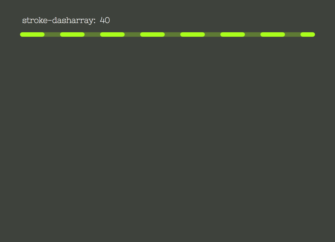
stroke-dasharray (معاينة كبيرة) تُظهر الصورة الموجودة على اليسار ضبط الخاصية stroke-dasharray من 0 إلى 238 بكسل ، وهو طول محيط الدائرة.
تمثل الصورة الثانية خاصية stroke-dashoffset التي تعوض بداية صفيف الشرطة. يتم ضبطه أيضًا من 0 إلى طول محيط الدائرة.
stroke-dasharray و للحصول على تأثير الملء ، سنقوم بضبط stroke-dasharray على طول المحيط ، بحيث يتم ملء كل طوله بشرطة كبيرة وبدون فجوة. سنقوم أيضًا بتعويضها بنفس القيمة ، بحيث يتم "إخفاءها". بعد ذلك ، سيتم تحديث مجموعة stroke-dashoffset إلى قيمة الملاحظة المقابلة ، وملء الحد وفقًا لمدة الانتقال.
سيتم تحديث الخصائص في البرامج النصية من خلال CSS Variables. دعنا نعلن عن المتغيرات ونضع الخصائص:
.circle__progress--fill { --initialStroke: 0; --transitionDuration: 0; stroke-opacity: 1; stroke-dasharray: var(--initialStroke); stroke-dashoffset: var(--initialStroke); transition: stroke-dashoffset var(--transitionDuration) ease; } من أجل تعيين القيمة الأولية وتحديث المتغيرات ، لنبدأ بتحديد جميع عناصر .note-display مع document.querySelectorAll . سيتم تعيين فترة transitionDuration إلى 900 مللي ثانية.
بعد ذلك ، نقوم بالتكرار من خلال مجموعة شاشات العرض ، وتحديد .circle__progress.circle__progress--fill واستخراج السمة r المحددة في HTML لحساب طول المحيط. باستخدام ذلك ، يمكننا تعيين القيم الأولية --dasharray و --dashoffset .
ستحدث الرسوم المتحركة عندما يتم تحديث المتغير --dashoffset بـ 100 مللي ثانية setTimeout:
const displays = document.querySelectorAll('.note-display'); const transitionDuration = 900; displays.forEach(display => { let progress = display.querySelector('.circle__progress--fill'); let radius = progress.r.baseVal.value; let circumference = 2 * Math.PI * radius; progress.style.setProperty('--transitionDuration', `${transitionDuration}ms`); progress.style.setProperty('--initialStroke', circumference); setTimeout(() => progress.style.strokeDashoffset = 50, 100); }); لبدء الانتقال من الأعلى ، يجب تدوير عنصر .circle__svg :
.circle__svg { transform: rotate(-90deg); } 
الآن ، دعنا dashoffset قيمة مجموعة الشرطة - بالنسبة للملاحظة. سيتم إدراج قيمة الملاحظة في كل عنصر li من خلال السمة data- *. يمكن تبديل * لأي اسم يناسب احتياجاتك ويمكن بعد ذلك استرجاعه في JavaScript من خلال مجموعة بيانات العنصر: element.dataset.* .
ملاحظة : يمكنك قراءة المزيد حول السمة data- * على MDN Web Docs.
ستسمى السمة الخاصة بنا " data-note ":
<ul class="display-container"> + <li class="note-display" data-note="7.50"> <div class="circle"> <svg width="84" height="84" class="circle__svg"> <circle cx="41" cy="41" r="38" class="circle__progress circle__progress--path"></circle> <circle cx="41" cy="41" r="38" class="circle__progress circle__progress--fill"></circle> </svg> <div class="percent"> <span class="percent__int">0.</span> <span class="percent__dec">00</span> </div> </div> <span class="label">Transparent</span> </li> + <li class="note-display" data-note="9.27"> <div class="circle"> <svg width="84" height="84" class="circle__svg"> <circle cx="41" cy="41" r="38" class="circle__progress circle__progress--path"></circle> <circle cx="41" cy="41" r="38" class="circle__progress circle__progress--fill"></circle> </svg> <div class="percent"> <span class="percent__int">0.</span> <span class="percent__dec">00</span> </div> </div> <span class="label">Reasonable</span> </li> + <li class="note-display" data-note="6.93"> <div class="circle"> <svg width="84" height="84" class="circle__svg"> <circle cx="41" cy="41" r="38" class="circle__progress circle__progress--path"></circle> <circle cx="41" cy="41" r="38" class="circle__progress circle__progress--fill"></circle> </svg> <div class="percent"> <span class="percent__int">0.</span> <span class="percent__dec">00</span> </div> </div> <span class="label">Usable</span> </li> + <li class="note-display" data-note="8.72"> <div class="circle"> <svg width="84" height="84" class="circle__svg"> <circle cx="41" cy="41" r="38" class="circle__progress circle__progress--path"></circle> <circle cx="41" cy="41" r="38" class="circle__progress circle__progress--fill"></circle> </svg> <div class="percent"> <span class="percent__int">0.</span> <span class="percent__dec">00</span> </div> </div> <span class="label">Exemplary</span> </li> </ul> ستعمل طريقة parseFloat على تحويل السلسلة التي تم إرجاعها بواسطة display.dataset.note إلى رقم فاصلة عائمة. يمثل offset النسبة المئوية المفقودة للوصول إلى الدرجة القصوى. لذلك ، بالنسبة إلى ملاحظة 7.50 ، سيكون لدينا (10 - 7.50) / 10 = 0.25 ، مما يعني أنه يجب تعويض طول circumference بنسبة 25% من قيمته:
let note = parseFloat(display.dataset.note); let offset = circumference * (10 - note) / 10; تحديث scripts.js :
const displays = document.querySelectorAll('.note-display'); const transitionDuration = 900; displays.forEach(display => { let progress = display.querySelector('.circle__progress--fill'); let radius = progress.r.baseVal.value; let circumference = 2 * Math.PI * radius; + let note = parseFloat(display.dataset.note); + let offset = circumference * (10 - note) / 10; progress.style.setProperty('--initialStroke', circumference); progress.style.setProperty('--transitionDuration', `${transitionDuration}ms`); + setTimeout(() => progress.style.strokeDashoffset = offset, 100); }); 
قبل أن نمضي قدمًا ، دعنا نستخرج انتقال stoke إلى طريقته الخاصة:
const displays = document.querySelectorAll('.note-display'); const transitionDuration = 900; displays.forEach(display => { - let progress = display.querySelector('.circle__progress--fill'); - let radius = progress.r.baseVal.value; - let circumference = 2 * Math.PI * radius; let note = parseFloat(display.dataset.note); - let offset = circumference * (10 - note) / 10; - progress.style.setProperty('--initialStroke', circumference); - progress.style.setProperty('--transitionDuration', `${transitionDuration}ms`); - setTimeout(() => progress.style.strokeDashoffset = offset, 100); + strokeTransition(display, note); }); + function strokeTransition(display, note) { + let progress = display.querySelector('.circle__progress--fill'); + let radius = progress.r.baseVal.value; + let circumference = 2 * Math.PI * radius; + let offset = circumference * (10 - note) / 10; + progress.style.setProperty('--initialStroke', circumference); + progress.style.setProperty('--transitionDuration', `${transitionDuration}ms`); + setTimeout(() => progress.style.strokeDashoffset = offset, 100); + }لاحظ زيادة القيمة
لا يزال هناك انتقال الملاحظة من 0.00 إلى قيمة الملاحظة المراد بناؤها. أول شيء يجب فعله هو فصل الأعداد الصحيحة والقيم العشرية. سنستخدم طريقة السلسلة split() (تأخذ وسيطة تحدد مكان كسر السلسلة وتعيد مصفوفة تحتوي على كلتا السلاسل المقطوعة). سيتم تحويلها إلى أرقام وتمريرها كوسيطات إلى وظيفة increaseNumber() ، جنبًا إلى جنب مع عنصر display وعلامة تشير إلى ما إذا كان عددًا صحيحًا أم عشريًا.
const displays = document.querySelectorAll('.note-display'); const transitionDuration = 900; displays.forEach(display => { let note = parseFloat(display.dataset.note); + let [int, dec] = display.dataset.note.split('.'); + [int, dec] = [Number(int), Number(dec)]; strokeTransition(display, note); + increaseNumber(display, int, 'int'); + increaseNumber(display, dec, 'dec'); }); .percent__dec .percent__int increaseNumber() className لقد حددنا فترة transitionDuration إلى 900ms . الآن ، لتحريك رقم من 0 إلى 7 ، على سبيل المثال ، يجب تقسيم المدة على الملاحظة 900 / 7 = 128.57ms . تمثل النتيجة المدة التي سيستغرقها كل تكرار زيادة. هذا يعني أن setInterval الخاصة بنا ستطلق كل 128.57ms .
مع تعيين هذه المتغيرات ، دعنا نحدد setInterval . سيتم إلحاق متغير counter بالعنصر كنص وزيادة في كل تكرار:
function increaseNumber(display, number, className) { let element = display.querySelector(`.percent__${className}`), decPoint = className === 'int' ? '.' : '', interval = transitionDuration / number, counter = 0; let increaseInterval = setInterval(() => { element.textContent = counter + decPoint; counter++; }, interval); } 
بارد! إنه يزيد القيم ، لكنه يفعل ذلك إلى الأبد. نحتاج إلى مسح setInterval عندما تحقق الملاحظات القيمة التي نريدها. يتم ذلك باستخدام وظيفة clearInterval :
function increaseNumber(display, number, className) { let element = display.querySelector(`.percent__${className}`), decPoint = className === 'int' ? '.' : '', interval = transitionDuration / number, counter = 0; let increaseInterval = setInterval(() => { + if (counter === number) { window.clearInterval(increaseInterval); } element.textContent = counter + decPoint; counter++; }, interval); } 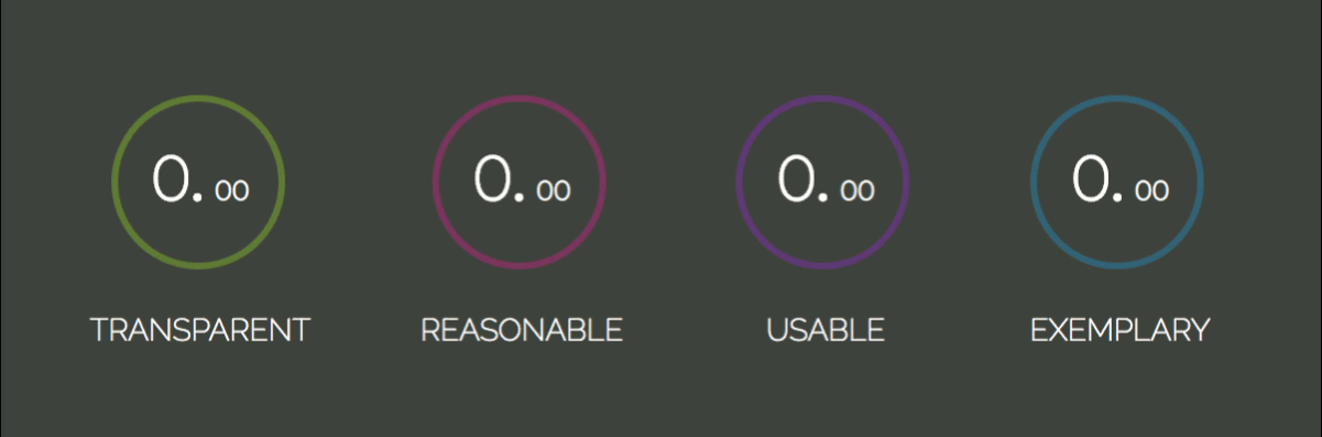
الآن يتم تحديث الرقم حتى قيمة الملاحظة ويتم مسحه باستخدام وظيفة clearInterval() .
هذا إلى حد كبير لهذا البرنامج التعليمي. اتمنى ان تكون قد استمتعت به!
إذا كنت ترغب في بناء شيء أكثر تفاعلية ، فراجع تعليمي للعبة الذاكرة الذي تم إنشاؤه باستخدام Vanilla JavaScript. وهو يغطي مفاهيم HTML5 و CSS3 و JavaScript الأساسية مثل تحديد المواقع والمنظور والانتقالات و Flexbox ومعالجة الأحداث والمهلة والثالثة.
ترميز سعيد!